

House Whites
Our go-to white paints for trim, walls, ceilings and beyond.

Probably the most valuable advice I’ve ever received about choosing paint colors is to look at the paint color in the room itself, in its natural environment. But there are certain whites that we come back to again and again, that, when choosing a home’s “house white,” we sample in the room as a starting point. Today, I wanted to share what those whites are, so that you can try them, too!
So, what is a “house white”? Your “house white” is what we call the trim color that you will use throughout your house, anywhere where you require white trim. Of course, some rooms call for green trim or brown trim or pink trim — it all depends on the walls and the decoration of the room — but having a white that you can employ throughout the house where it is needed, is a way to create cohesiveness, as well as make your paint schedule a lot simpler.
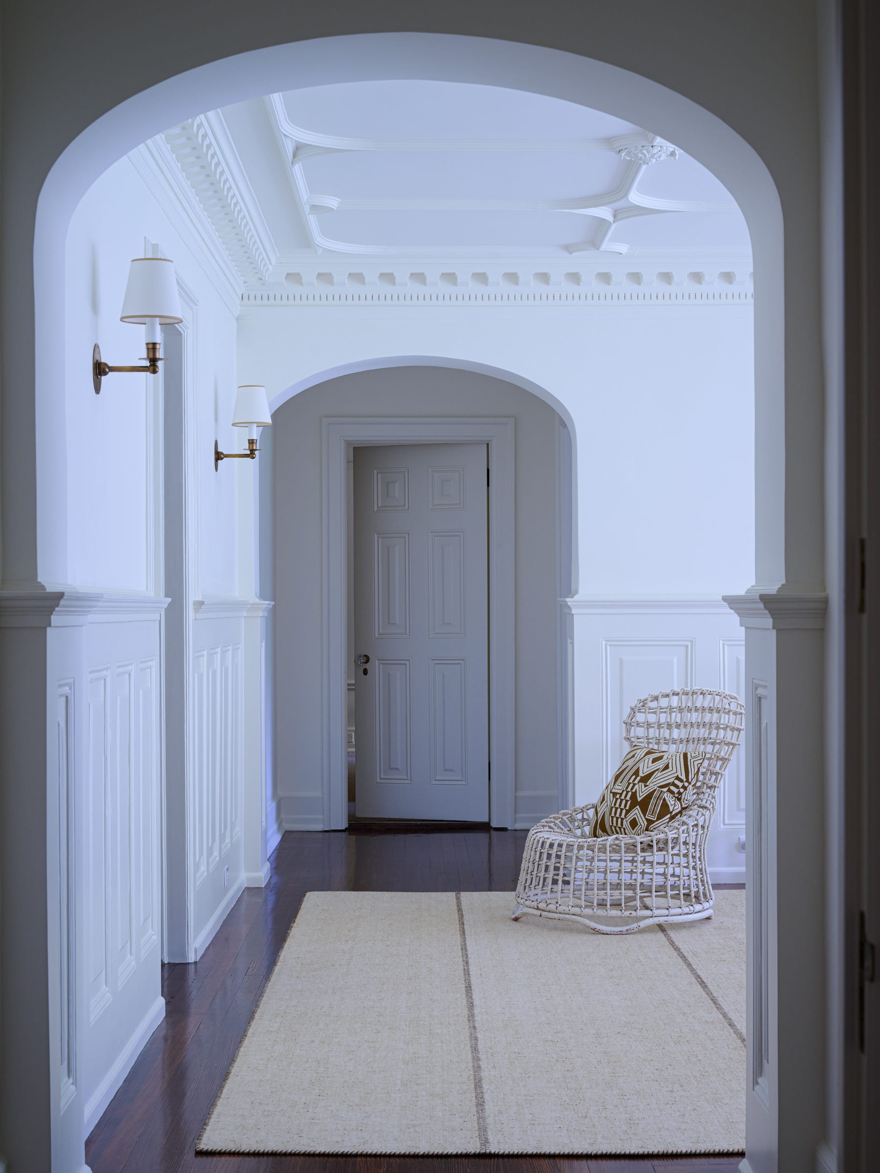
Now, about those whites. We tend to stay away from whites that are very stark, have a lot of blue in them, or are “marshmallow” as Suzanne likes to call them. Instead, we veer towards whites that have a tint of red or yellow in them. Farrow & Ball Pointing is a white that we come back to again and again. In this entry from our Briarcliff Manor project, we painted the walls, trim, and ceilings in Pointing. I think this is called “color drenching” these days — when you paint everything the same color. When you are using white in this way, it has a slightly modernizing effect (which can be nice), especially in an interior like the one below, which had a lot of traditional, original architectural detail.
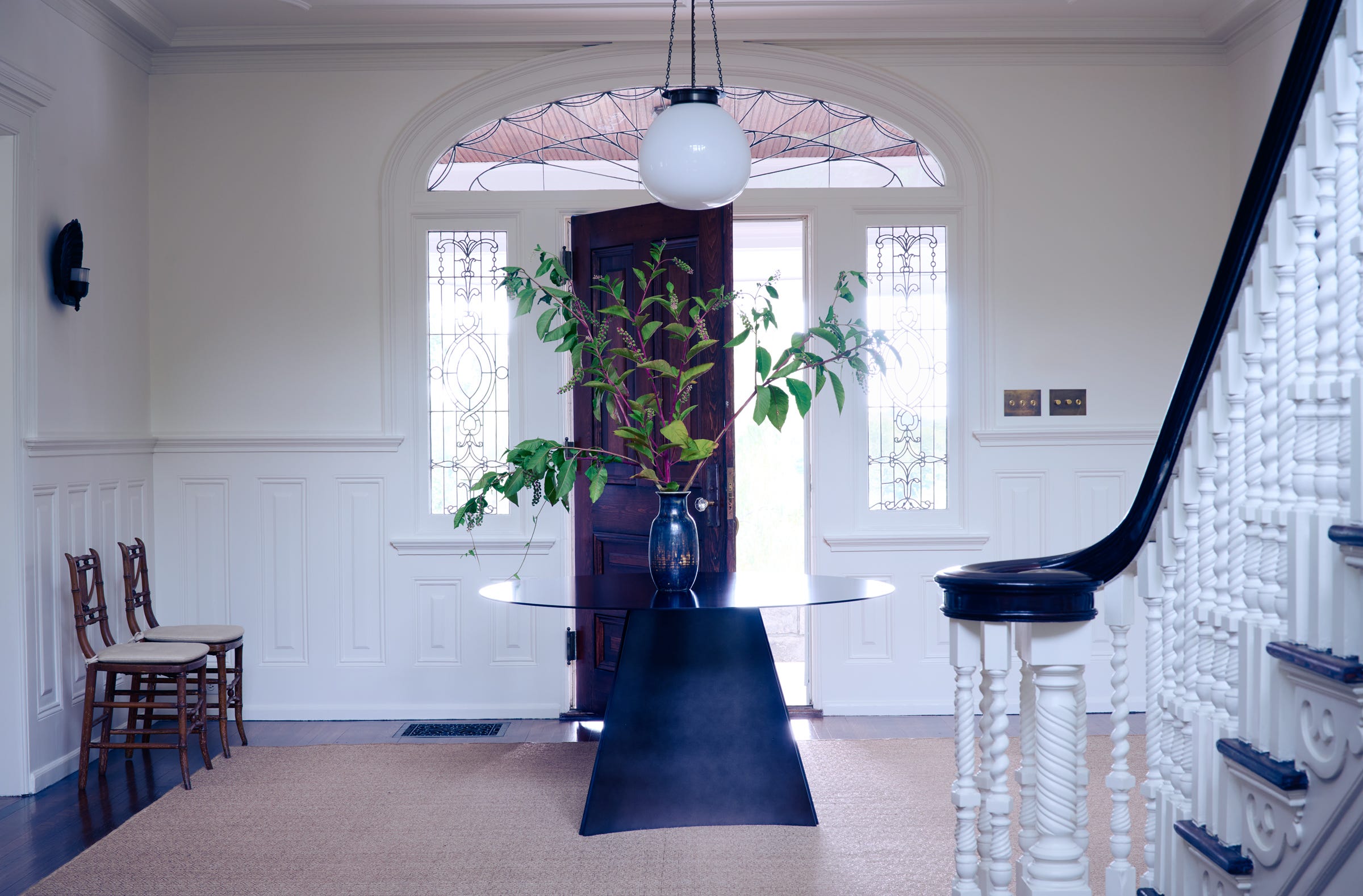
Here is a view of the second floor landing of the same house where you can see how effective it was to paint everything the same color.
In rooms that are south facing, with plenty of natural sunlight, we often use Farrow & Ball’s Wimborne White. It has a touch of warm yellow pigment which makes it very easy to use. In my house in Southport, CT (below), my “house white” was Wimborne. It was a nice pairing to the tea stained walls that were decorative painted.
Similarly, we chose Wimborne to paint the paneled walls and ceiling of this sunlit second floor office above the garage. It looks fresh, but not too bright.
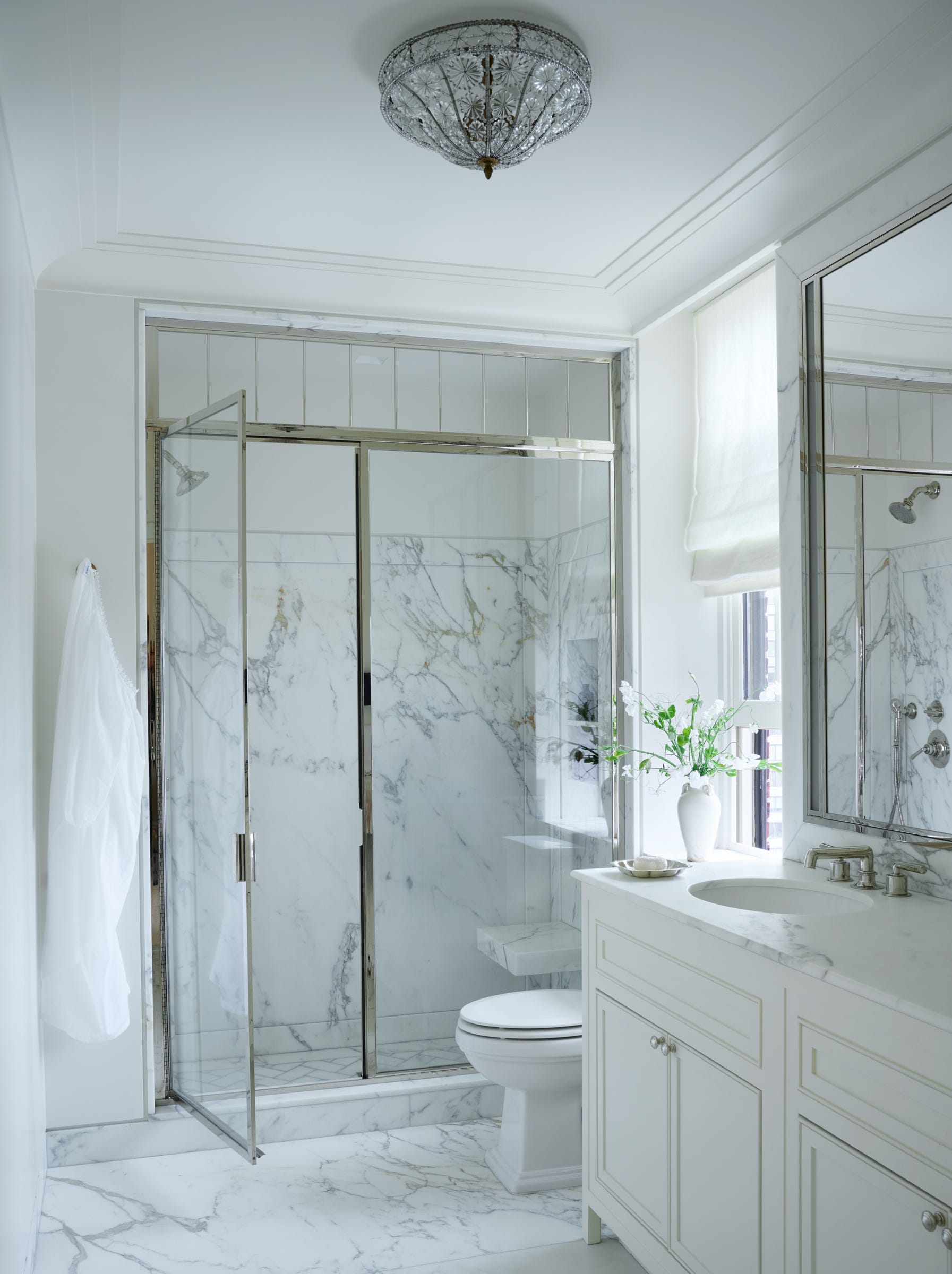
For apartment living, when natural light is often not at a premium, we tend to prefer whites that are slightly cooler. In this kitchen on Park Avenue, the trim was Farrow & Ball Off White and the walls were painted FB Slipper Satin.
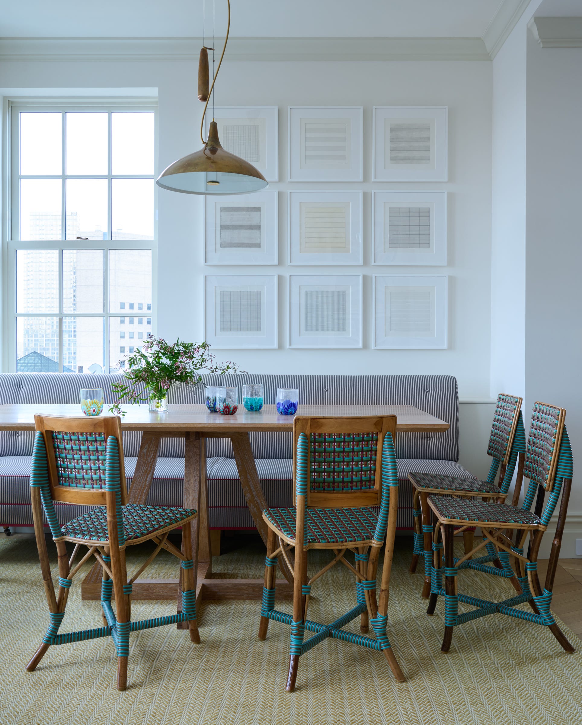
In the same apartment, we painted the walls and trim of the newly renovated Primary Bathroom in Farrow & Ball’s Pointing. Sometimes the “house white” rule does not apply!
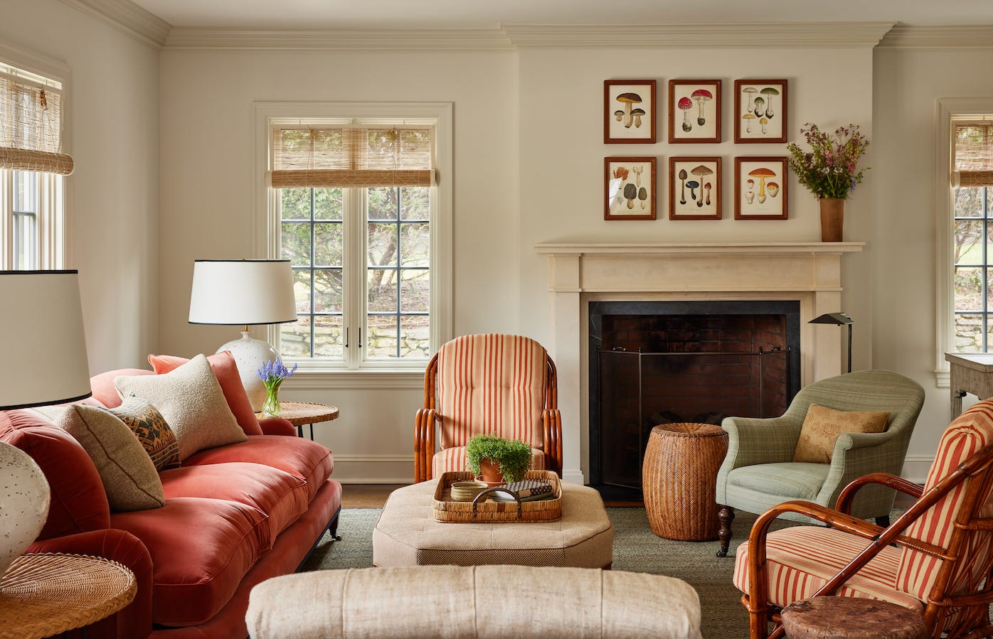
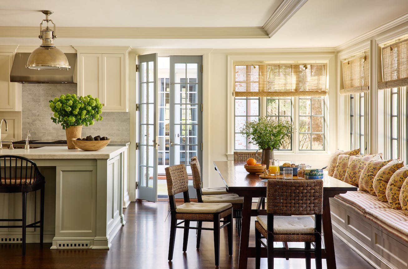
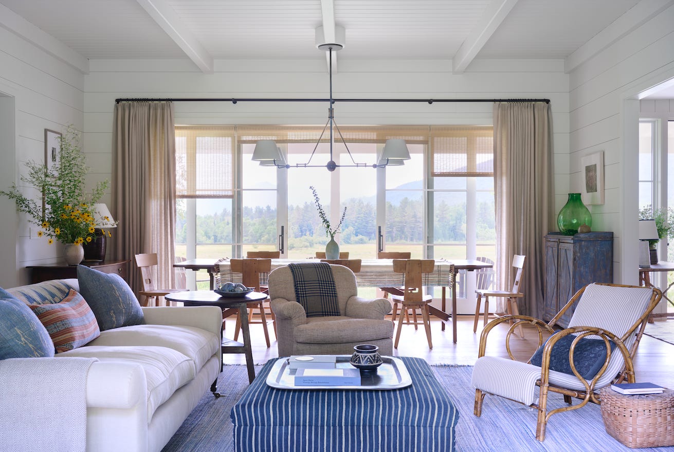
In rooms where the textiles and rugs are colorful, and there is ample sunlight, we prefer to select whites that have some taupe-y-ness to them. In this family room at a Connecticut country house, we used Farrow and Ball Shadow White on both the trim and the walls. On the walls it was used at half strength. This is a great trick if you want some definition for your trim but want the walls to be in the same hue, just slighting lighter. You add 50% white to your mix.
We carried this paint color combination into the kitchen, which was a very sunny, bright room.
And for this house in the Adirondack mountains, the walls ceiling, and trim are all wrapped in Benjamin Moore’s Gray Mist (OC-30). A brighter, crisper white than we typically use, but it suited the modern architecture of the house.
Let us know if you have more questions about choosing the perfect shade of white for your projects!